3.1
A Figma Design System that helps individuals and organisations Scale.
53 Components. 45,264 ways to use them
Web and App components, Properties and Variants with thousands of possibilities.
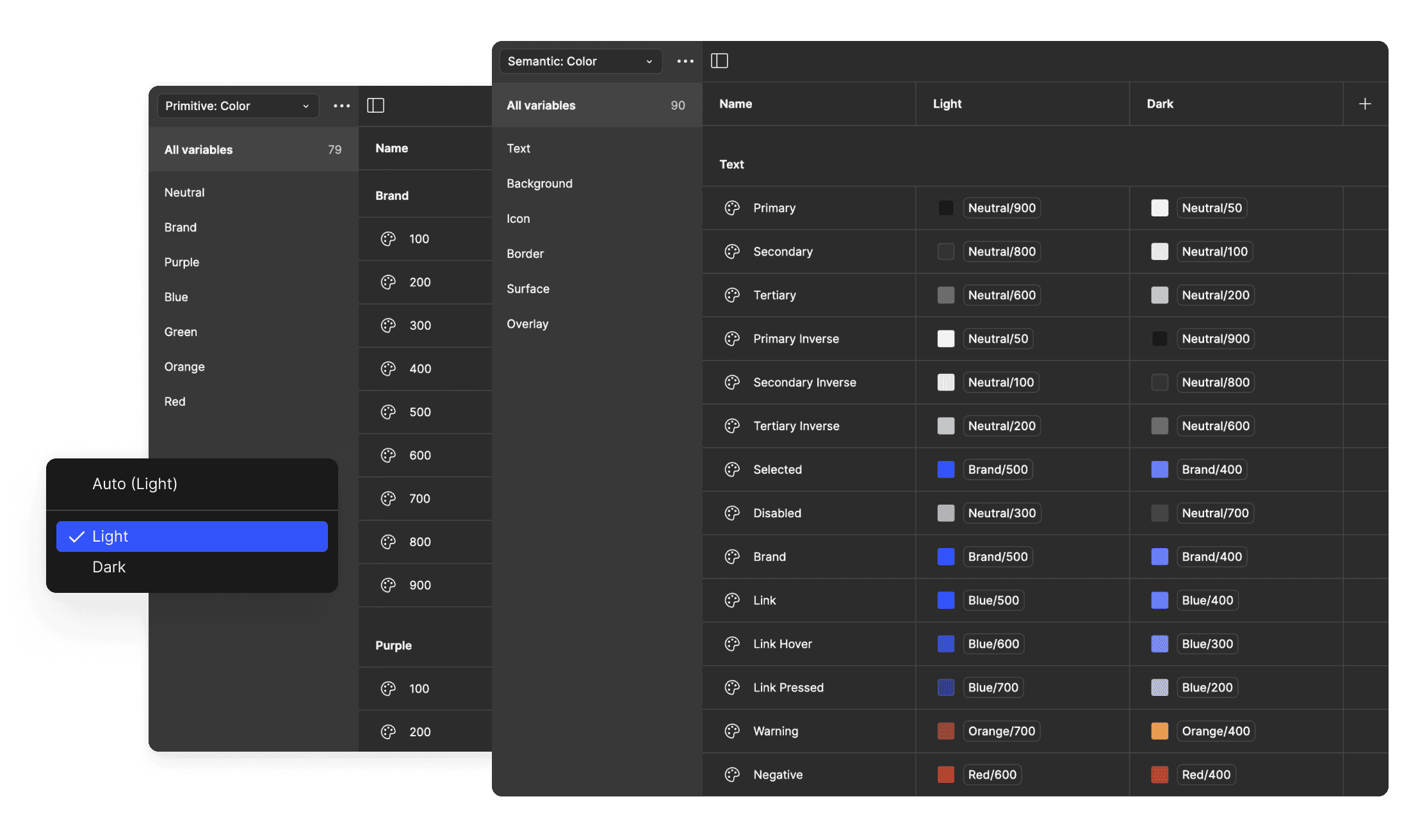
720 Variables and Styles
Semantic Color and Type Variables, Spacing, Border and Elevation.
936 Icons across three sizes
Feather and status icons at 16, 24, and 32px.
14 Sections. 138 possibilities.
Responsive Hero, Feature, Logo, Pricing, CTA, FAQ and Carousel modules.
Liquid Glass Materials and Components are here!
Design for Apple’s latest operating system with 14 new Liquid Glass components
Use custom icons instead of Apple’s SF Symbols
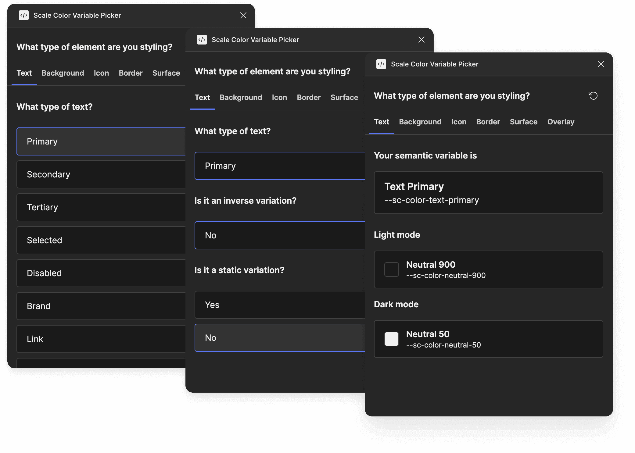
Scale’s first Figma plugin, Color Variable Picker 🤘
Helps you find the right semantic color variable when designing
Learn Scale’s semantic spec as you go
Global Semantic Color
Use color in a meaningful way across your projects, toggle automatically between Light and Dark modes and watch updates ripple across every screen instantly.
Responsive Typography
Perfect hierarchy, zero math. Our t-shirt sized type scale uses fluid responsiveness to adapt flawlessly from Desktop to Mobile. No manual breakpoint tweaks required.

Smart Component Library
Don't build from scratch, just configure. Access a robust library pre-wired with variants, variables and properties. Simply drag, drop, and toggle the props to match your needs.
Adaptive Section Blocks
Drag-and-drop sections that instantly inherit your global theme and resize perfectly for every device. Select the properties you want and take control of composition.
Solo - Most Popular 🤘
Team
FAQs
Everything you need to know about Scale.
Sign up for updates
Stay up to date with releases and other related Scale news.